Type:
Figma UI Prototype
Role:
Researcher, Designer, Prototype Maker
Brief:
As part of a video series and as an opportunity to learn how to use Figma, I critique a website’s UI design on their home page and redesign the website to be more user friendly. For the first installment, my focus was on UK car leasing website Ling’s Cars.
Research:
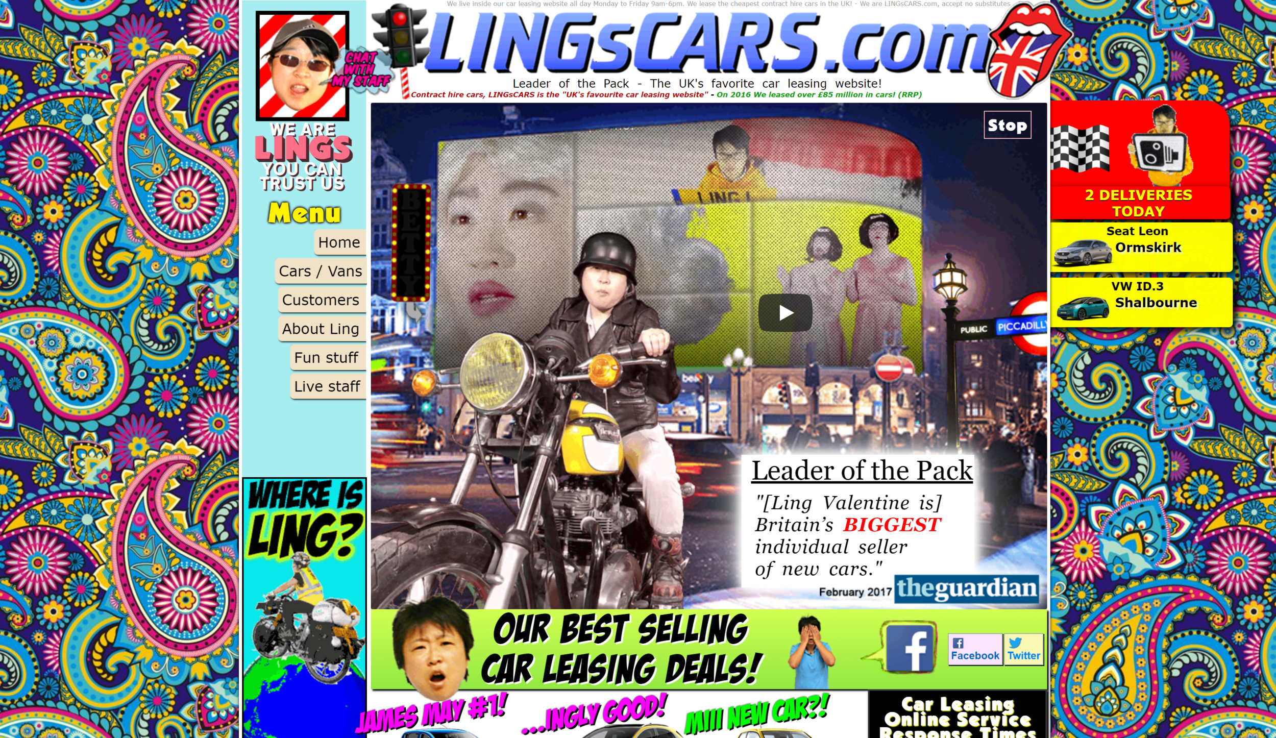
To understand the website, I spent many hours exploring the home page, taking note on the colours, layout and ease of navigation. Some notable things that needed improvement was a reduction of perfunctory movement on the page as well as a simplification of colours as it was visually distracting to the purpose of the website.
In addition to exploring Ling’s Cars, I also explored other car leasing websites such as smartleasing and subscribacar to get inspiration and an understanding of what similar service websites did regarding their page layout and overall visual language. Noteably, both these websites were reserved with colour usage and tended to lean to a more clean minimalist design.
However, while this minimal design is present in many websites today, most interesting was the research into user reviews of Ling’s Cars on Google Reviews. Many of the positive reviews mention the website in a positive light, expressing how unique and wild the website design is. So while the goal was to improve the usability of the website, I was aware that for many people, the absurdity of the website is a feature itself so the redesign would have to retain a certain “Ling charm” as well.
Results:
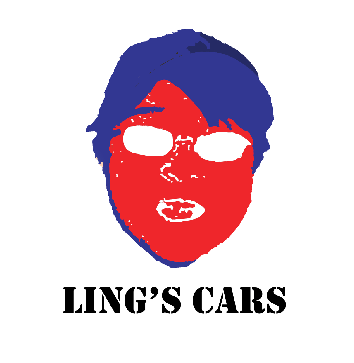
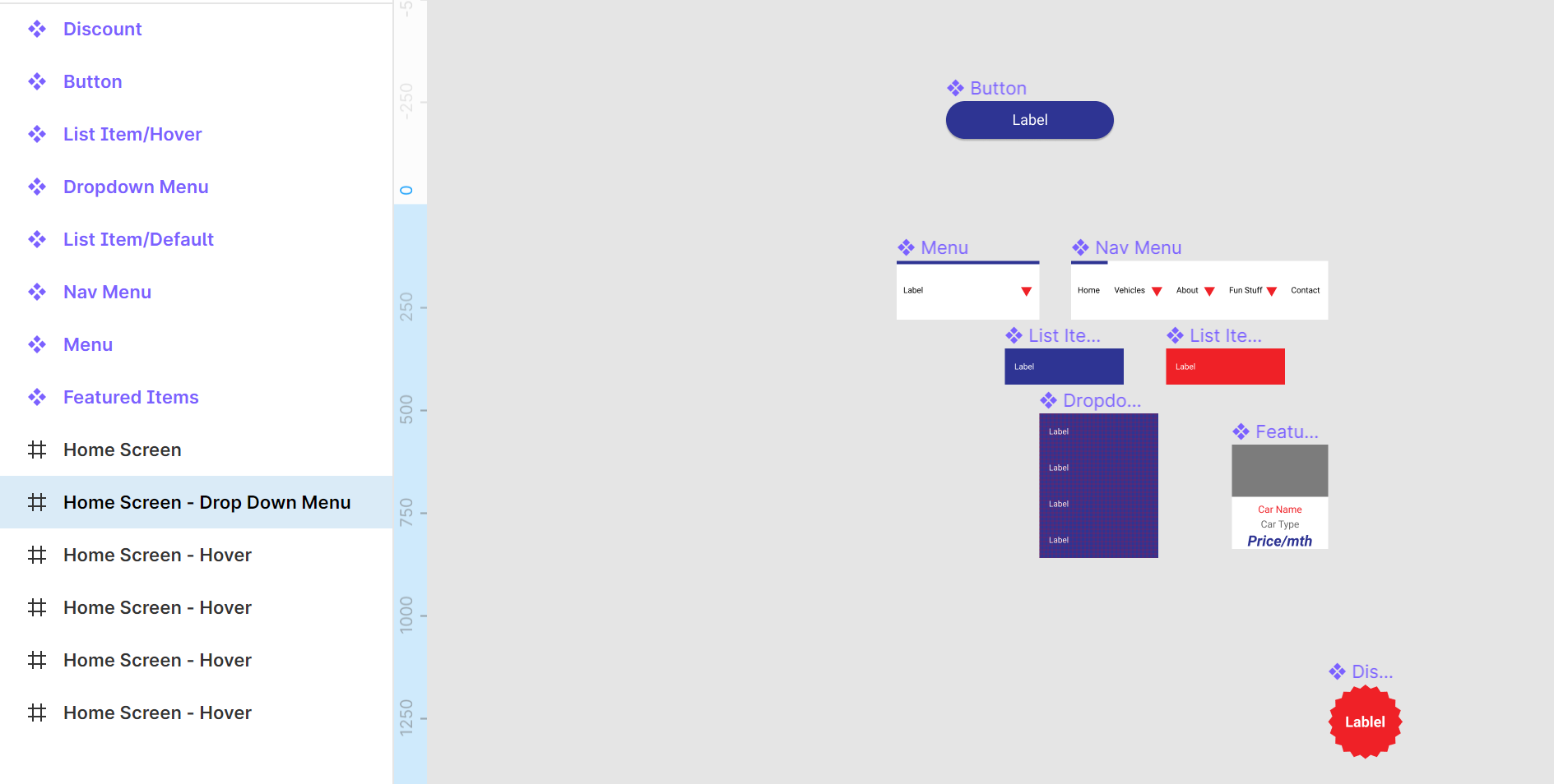
The logo was redesigned as a colour reduction of Ling’s face, much like the original logo. Regarding the colour scheme, it uses blue, red and white which are the same colours that are found on the Union Jack. The text for “Ling’s Cars” was inspired by military stencil letters as an homage to the “Missile Truck” found on the website.
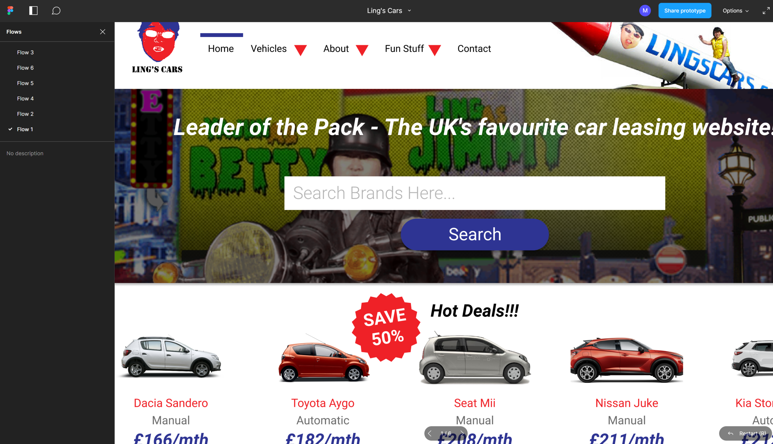
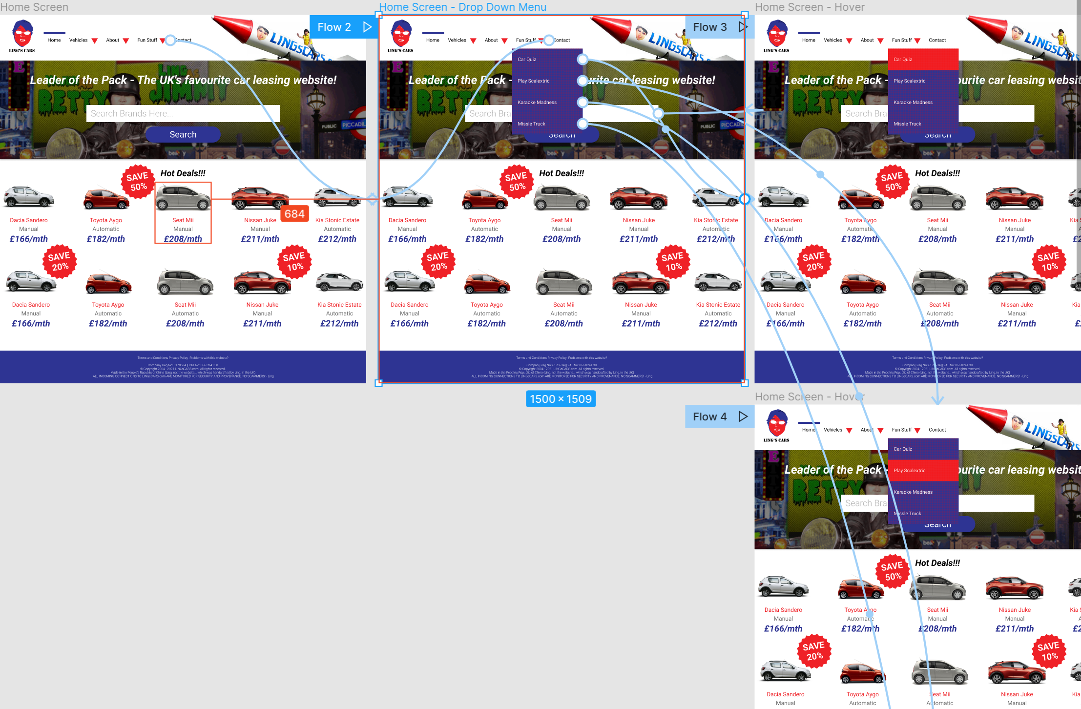
The navigation items have be moved from the side to the top of the screen, with a small rectangle bar indicating which page the user is on (in this case, the home page). Red arrows indicate a drop down menu that users can click on to reveal more and as a user hovers over an item, the button will change from blue to red.
To retain some of the “Ling charm” the iconic “Missile Truck” was placed to fill out some of the empty space at the top of the screen as well as Ling on a motorcycle on the main banner with the slogan “Leader of the Pack - The UK's favorite car leasing website!”. This main banner also serves as a search bar, allowing for users to search for a brand of car.
Finally, some of the hot deals of the day are listed on the home page, with eye-catching saving badges to draw user’s attention to certain items. The listings include a photo of the car, car name, transmission type and price/month.
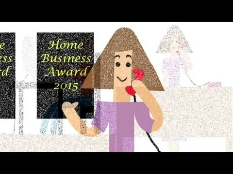
Prototype Video: https://youtu.be/l5S9Q2fvqLw
Process Video (first 24 hours): https://youtu.be/FJRnjz8jV4o
Type:
Adobe After Effects 3D Animation
Role:
Director, Animator
Brief:
Utilizing Adobe After Effects, create an animation (2 min MAX) to express anything from an artistic piece to an infomercial.
Research:
With such an open ended brief, I began to look into some of my personal interests in my life as potential subject/topics to create my animation on. At the time of creating this animation, I had been part of the Sydney street dance community and participated in many dance battles. I decided to focus in on that as my subject.
With the potential for many different animation styles in After Effects, since I had done 2D animations in the past, I was looking to see if there were other potential avenues for creating this project. After some exploration, I found the 3D potential of After Effects to be quite compelling and unique so that is the style that I decided to focus on.
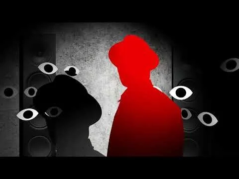
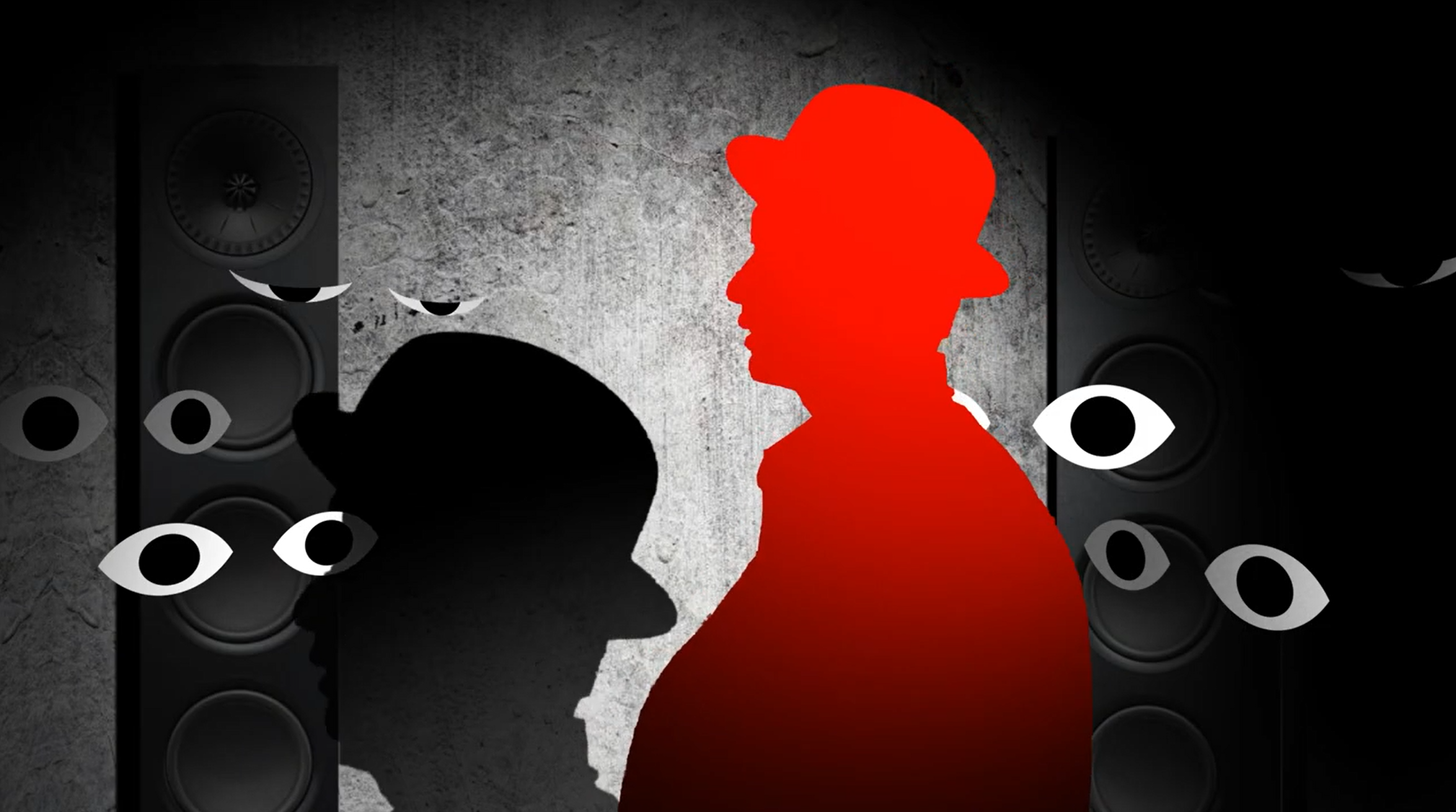
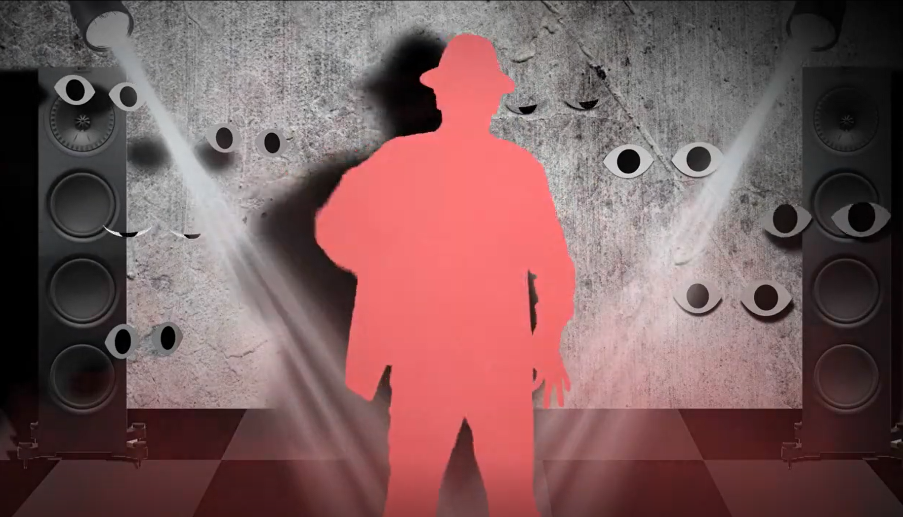
Finally, researching into dance focused animations, many would put focus on the “silhouette” of the dancer by choosing a single colour to mask over the moving dancer. The aesthetic was clean, minimal and showcased movement in a new light.
Results:
“Perform” is a 3D animation story that follows the development of a dancer who must overcome their performance anxiety in front of the eyes of the audience. The main inspirations for the montage sequence are training sequences in movies such as Rocky (1976).
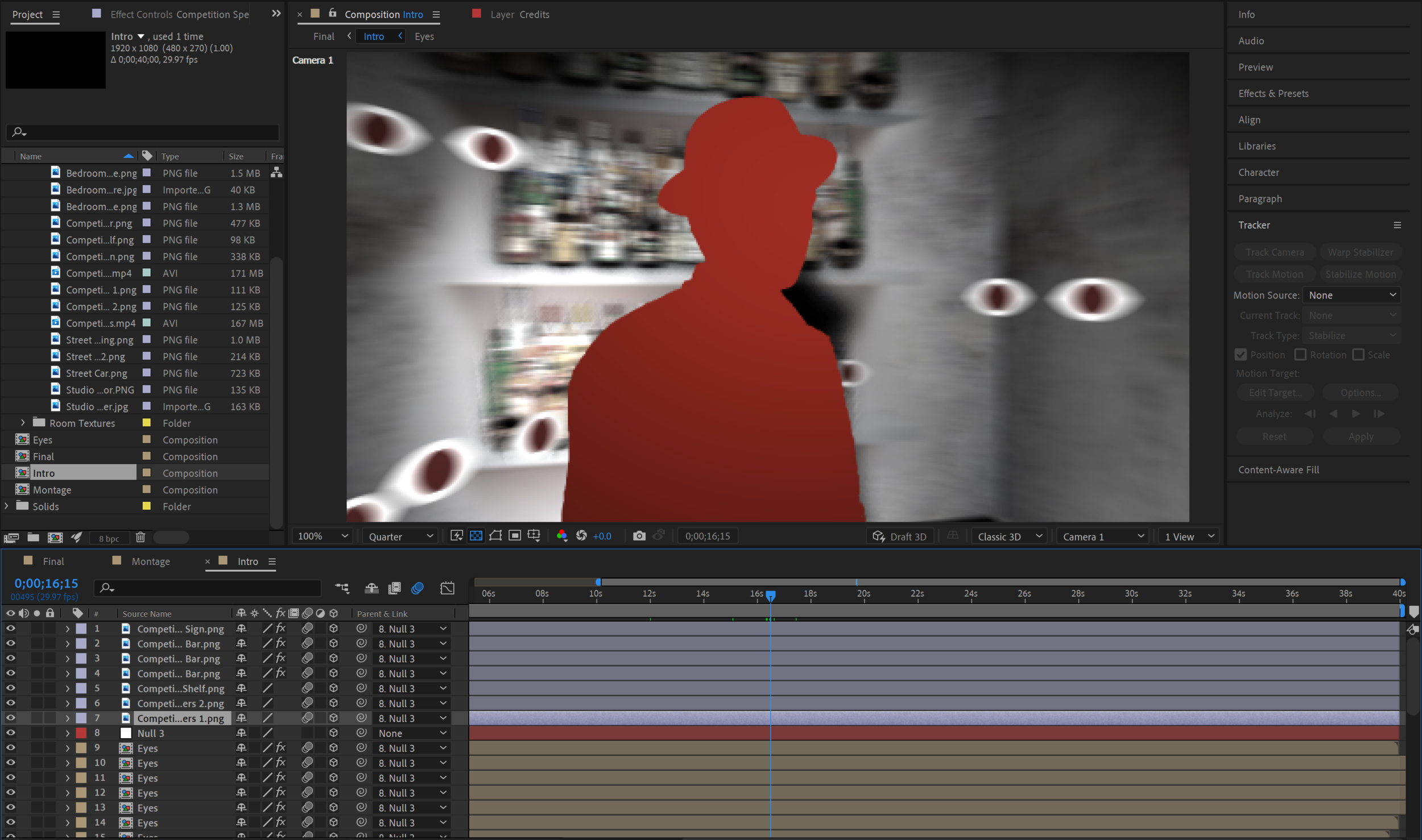
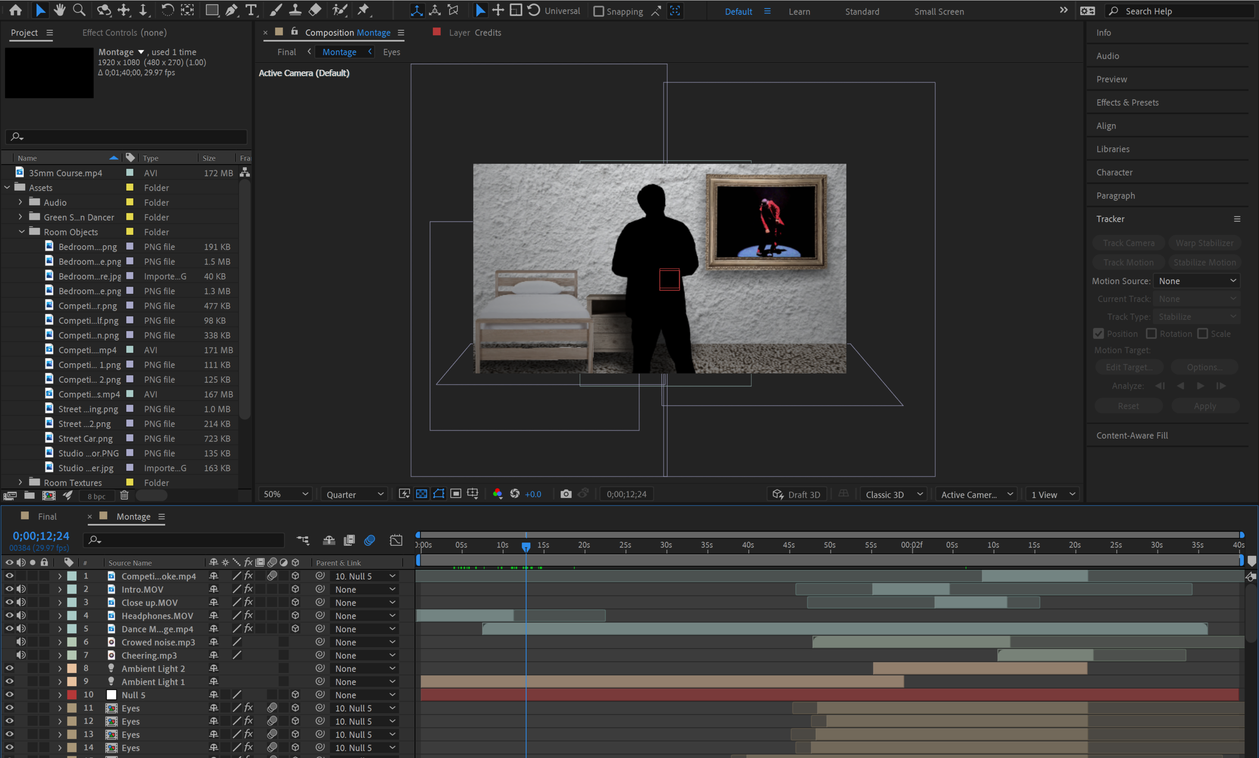
The main techniques used in this project were green screen, track matte and 3D environments. Each scene is constructed out of material textures to represent the various rooms (e.g. wood floors for the dance studio or concrete walls for the club) within a 3D space with various appropriate elements added in for extra detail. The reason for this being that with a light source, shadows would be cast on the scene so the placement of each object was important.
The protagonist was filmed in front of a green screen and then added into the scene in the foreground so that shadows would be cast across the scene. The most amusing shot was the beginning 360 camera “spin”, where the green screen character in the filming process had to spin around since it is not possible to spin the 2D green screen layer to match the room spinning.
Video Link: https://youtu.be/ijaRfXP8u5U
Type:
Adobe Premiere Short Film
Role:
Director, Editor
Brief:
Create a short film (2-3 minute) utilizing montage sequences.
Research:
With a brief as open as this, it allowed for great creativity. When exploring montage sequences online, I was sparked with the idea to create a lifetime narrative in a short time span. This would be shot from a POV perspective so that the viewer would feel like they were part of the film itself.
An inspiration for this POV perspective would be the famous “GO” videos by YouTuber Nigel Sylvester. famous “GO” videos. To summarise, these videos select a city and using a wide lens camera mounted on a person, the video showcases Nigel performing a plethora of activities in said city.
Results:
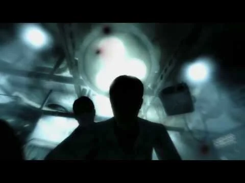
“Breathe” depict the life of a person from birth to death. Utilising footage found online as well as shooting my own footage from a first person perspective using a GoPro camera, the entire video is shot from the perspective of the protagonist as they go through life. The breath present in each shot is to imply the idea of each breath bringing us closer to death.
The starting shot utilizes the POV birth scene from the popular video game Fallout 3 to indicate the start of the protagonist’s life. Transitions are done with the blinking of the eye (which was done using key-frames and simple shape overlays), jumping forward many years to different stages of life.
Video Link: https://youtu.be/vaihtChMhio
Type:
Final Cut Pro Video Installation for Vivid
Role:
Director, Editor
Special thanks to Julian O'Shanesy and Blair Cardile
Brief:
For the Vivid Sydney light festival, create a 1 minute piece of digital media about marine conservation for the digital display located in the Central Park Mall.
Research:
When researching about marine conservation, there where many potential topics to explore (from coral bleaching to endangered species) but in much of my research, the theme of pollution was one that came up often so that was the general topic that was explored further.
Plastic pollution is something that still affects our oceans to this day and what is somewhat shocking is that plastic can break apart into small particles that are consumed by sea life. In many cases, this sea life will end up dying due to this plastic but for those that are caught for human consumption, that plastic can end right back up inside human bodies.
Given this shocking consequence of plastic pollution in our oceans, I wanted to create something that would strongly communicate the harm that is being done to our oceans due to plastic pollution.
Results:
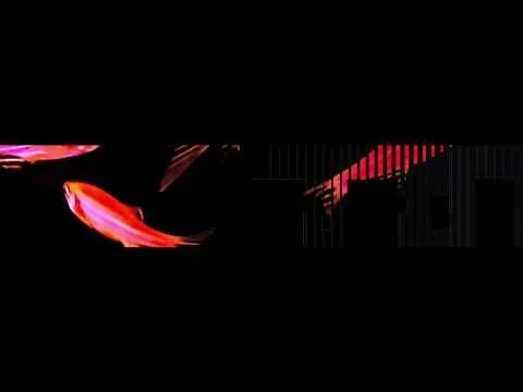
For my piece, I decided to create something that was both visceral and real. Considering the amount of pollution that is present in our oceans, the video depicts fish swimming at the start. It uses colour correction to change the colours of the fish in the stock footage in a way that is mesmerizing and beautiful to invite views to enjoy the beauty of marine life.
However, once the transition to the fish line is made, the video displays a dead fish with various piece of trash being pulled out of it. This rather disgusting depiction of pollution was done with full practical effects to show a hyperbolic (but very real) depiction of where plastic pollution ends up - inside the marine life, often killing them.
The aspect ratio and overlay of black spaces mimics the same digital display in the Central Park Mall (with the 2 large blacked out areas being elevators. Because of this knowledge beforehand, the footage and framing had to be done to accommodate this unconventional screen.
Video Link: https://youtu.be/blvkEHjgG1o
Type:
Adobe After Effects 2D Animation
Role:
Director, Artist, Animator
Brief:
For this animation project, create a 1 minute advertisement for a product or service.
Research:
Given that the brief allowed us to pick anything, I decided to research obscure inventions to discover some novel/gimmick products in order to give them a chance to be promoted. There were many strange things on the internet but I decided to choose the very obscure “Baby Mop” as my product of choice.
For animation style, I wanted to go for a simple 2D shapes animation with a minimalist style to promote the product. As for the product itself, that would be shown in a full photo format for a comedic stark contrast. This was inspired by the strange live action cuts that can be found in animation show such as SpongeBob SquarePants.
Results:
Using After Effects to do the animation, my ad consists of a mini story about a family and the roles of each family member. This narrative leans heavily on the comedic side, portraying the idea that children are a resource drain but have the potential to contribute to the family through the purchase of the “Baby Mop”.
Video Link: https://youtu.be/t-s3_iGK2XY
Type:
Processing Coding Animation
Role:
Coder
Brief:
Redesign the logo for the University of Sydney’s Design Lab.
Research:
For my design, I wanted to capture the essence of the design lab, which was how single ideas could manifest into enormous amounts of opportunities in innovation. However, the design also needed to credit the design lab's other main focus, which is its ability to compound multiple ideas into a single, creative vision. When doing background research on what kind of graphics would be effective in conveying this message, a common subject that kept appearing for me were laser displays, whereby multiple laser beams stemmed from a single origin point.
This was very useful inspiration for my final work as it could be interpreted as the lasers traveling away from the center point (ideas creating more opportunities) or all the lasers traveling towards the center point (ideas being consolidated into a single vision). Similarly, radial line drawings were an effective way of bringing a perceived depth to an otherwise, 2D animation.
Results:
My design attempts to convey the concept of how single ideas can branch out into a whole network/world of different possibilities. This is done by having all the lines drawn originate from the dot in the letter "i" in the word "designlab". This simple animation conveys this message effectively with a very strong symbolic meaning to the placement of the lines. The design lab is all about innovation and creation of new ideas. However, this design can also be seen in another way, where multiple ideas are being consolidated into one coherent vision.
This is another aspect of the design lab, as great ideas are brought together to create something amazing. With this logo being intended to be running on screens with various resolutions, the code has also being designed to be readjusted to fit the needs of different applications (e.g. screen saver, logo, splash screen, etc.)
Video Link: https://youtu.be/nNzrBSbxPpM
Type:
Rhinoceros 3D Model Toy
Role:
3D Designer, 3D Fabricator
Brief:
Utilizing Rhino 3D, design and construct a toy aimed at children.
Research:
When researching for this project, a lot of children’s toys involve some level of “collectability”. From thing such as Lego sets, Hot Wheels and Nerf Blasters, many of these products will include some form of collection by making similar set items have a connected gimmick or having sets share a similar visual aesthetic.
However, while the brief is more focused on children, when exploring Funko’s famous “Pop!” figurines, the mass appeal of these collectibles seemed to be a good way to go. With so many different media franchises represented and the stylized but homogenized aesthetic of each figurine, these figures both appeal to children and young adults alike.
Results:
For my piece, I decided to create a bobblehead snowman that could be collapsed down into a more static conventional figurine. Each section has a hook that twist locks down to the bellow section so that the user has the choice of a static or wobbly figure. Utilising 3D printers as well as laser cutters, the model was brought to life in the physical world.
The straightforward nature of the model is for the purpose of having different iterations that may include franchise specific details (e.g. a wand wielding snowman for a Harry Potter crossover). Alongside this, the display base includes a hook section that allows for multiple models to be connected together in one line, allowing for collectors to customise their display.
Type:
Final Cut Pro Promotional Video, UX Design Project
Role:
Director, Editor, UX Researcher
Special thanks to Bonjun Koo, Htoo Win Myint and Nay Min Thu
Brief
Enhance a public city infrastructure with playful user experience interactions.
Research
After performing individual research into city infastructure that people may come across on a day to day basis my team members and I decided to focus in on traffic light crossings as they are a common thing that many many people encounter.
When exploring interactions with the traffic light crossings, the pressing of the button was the one physical interaction that users engage with directly. When interviewing members of the public about their experience at traffic light crossings, many described it a boring experience that “tests their patience” and many users admitted to jaywalking, especially when they perceived the road to be empty or if they were in a hurry.
So with this information, the goal of the project was to create something that would be entertaining and distracting long enough to make users forget about the wait at a traffic light or prevent them from jaywalking.
[COVID-19 RE-FRAME AMENDMENT - with the pandemic discouraging physical contact with objects, proximity sensors may be used exclusively to achieve the same results in the following section]
Results
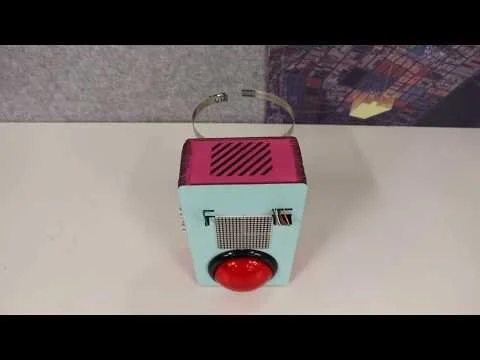
Button Buddy is the result of many prototype experiments. It is a sentient button that would respond to various stimuli such as proximity and touch. These responses leaned on comedic and novel spoken responses as if the button had feelings and opinions. An example proximity interaction includes a sensor that will detect pedestrians close to the curb of the road (suggesting a potential jaywalker) and speaking out “I wouldn’t do that if I were you” to grab their attention.
While I was involved with many stages of the project (especially the UX research phase), my primary responsibility was to edit the media promotion for the Button Buddy. Using Final Cut, a 2 minute video was created to showcase the product’s functions and intended effects.
Video Link: https://youtu.be/5zTJIltrVN0
Type:
Adobe Flash Animation
Role:
Director, Artist, Animator
Brief:
Utilizing the principles of animation, create a 1 minute animation
Research:
With such a broad brief, there was room to get creative with the narrative. I decided to create something comedic as simple hand drawn animations tend to lend themselves well to a lighter tone.
Results:
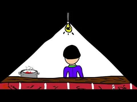
For my 1 minute flash animation, I decided to do a somewhat dark comedy of an unexpected situation, designed to subvert the expectations of the viewer. The narrative is designed to lead up to a typical punchline that has been shown in other media in the past but with an added twist to further subvert expectations.
Since hand drawing is something that doesn’t come naturally to me, I made sure to employ common camera angles/shots (even though there is no “camera” in an animation) such as wide angles, close ups and POV shots to ensure that the animation was engaging for audiences.
Video Link: https://youtu.be/4cCJiofFtU8
Type:
Processing Sketch Program
Role:
Coder
Brief
Create a sketchpad for users to customise their design for a product.
Research
To respond to the design brief, research was conducted into products that offer custom options for the end user. Many things from flashy sneakers to skateboard decks allow for the user to personalize their designs to make it uniquely their own but when it came to something that everyone owns, almost everyone owns a smartphone in modern society (with a large proportion being iPhones).
With so many iPhone users, one thing that many people use to express their individuality are phone cases. To allow for creativity, the project would have to include a number of tools for the user to choose from when designing their iPhone case. However, one of the limitations of this project is that since it is being designed for desktop computer use, sketching through mouse click and navigation is not a very natural way for this kind of sketching to be done. This software benefits greatly from a touchscreen and pen, where the simulation of drawing is much more intuitive.
Nevertheless, with the product and limitations in mind, the software aims to allow users to customise the design of an iPhone case and save their creations.
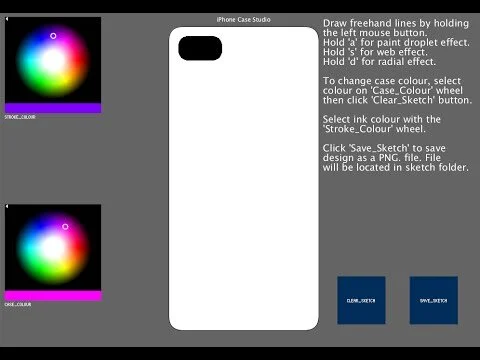
Results
I design drawing tools that would be visually appealing on an iPhone case exclusively. the sketchpad implements 3 different styles of drawing: paint droplets, radial lines and webs. A colour wheel is included to allow the user to change the colour of the ink. In addition to this, the program also allows for the user to change the colour of the case template with another colour wheel.
An option to clear all allows for users start over new if they decided to try something different and the sketchpad also includes a save button that would save their sketch as an image. To help with users understanding of the program, a short description in the top right of the screen informs the user of how to utilise the program.
Video Link: https://youtu.be/wcnM7lFG9WM